Wedding Invitation Mistakes to Avoid Before Printing
Planning a wedding involves countless decisions, and your invitations are among the most important details to get right. They provide guests with essential information while introducing the style of your celebration. Professionally printed Wedding Invites can create a beautiful first impression, but small design or wording mistakes can cause unnecessary confusion.
Before approving your artwork, take time to review these common wedding invitation mistakes and learn how to avoid them.
1. Forgetting Important Information
One of the most common mistakes is leaving out essential details.
Your invitations should clearly include your names, wedding date, ceremony time and venue address.
Don’t forget RSVP instructions and a response deadline.
If your ceremony and reception take place at different locations, make sure both addresses are provided.
2. Choosing Difficult-to-Read Fonts
Decorative fonts can look beautiful, but overly elaborate lettering may make important information difficult to understand.
Consider using script typography for names and headings while keeping smaller text simple.
Ensure sufficient contrast between your lettering and background.
Always check readability at the actual printed size.
3. Using Too Many Colours
An excessive number of colours can make your invitations appear cluttered.
Choose a coordinated palette that reflects your wedding theme.
Two or three complementary colours are often enough to create an attractive design.
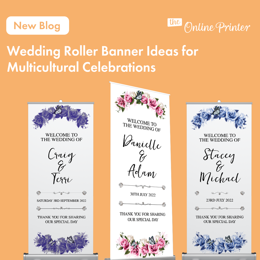
You can also use matching colours across your Wedding Roller Banners to maintain a consistent appearance throughout your celebration.
4. Overcrowding the Design
Trying to include every wedding detail on one invitation can make the layout difficult to follow.
Focus on essential information and allow sufficient space between sections.
If you need to provide accommodation recommendations, parking instructions or additional event details, consider using a separate information card.
A balanced design helps important details stand out.
5. Using Low-Resolution Images
Photographs and illustrations can make invitations more personal, but image quality matters.
Avoid enlarging small photographs beyond their original resolution.
Use high-quality artwork and check that decorative elements remain sharp.
Simply increasing the DPI setting won’t improve an image that lacks sufficient detail.
6. Forgetting to Coordinate Your Stationery
Matching printed materials can help create a polished wedding theme.
Consider using similar colours, typography and illustrations across invitations, signage and guest keepsakes.
For example, Personalised Company Mugs could inspire coordinated wedding gifts featuring your initials or wedding date.
Consistent artwork helps connect different elements of your celebration.
7. Missing Opportunities for Personalisation
Your invitations should reflect your personalities rather than simply following popular trends.
Consider including meaningful artwork, a favourite quote or a design inspired by your venue.
If you’re arranging guest experiences, Gift Vouchers may also complement selected wedding-related gifts.
8. Skipping the Final Proofread
Before approving your invitations, carefully check every name, date and address.
Ask someone else to review the artwork with fresh eyes.
Confirm your final guest information and printing requirements before placing your order.
Create Invitations With Confidence
Professionally printed wedding invitations can help set the tone for your special day.
By avoiding common mistakes, choosing readable designs and checking every detail, you can create beautiful stationery that guests will appreciate.
A little extra preparation before printing can make a significant difference to the finished result.