Business Card Design Mistakes That Could Be Hurting Your First Impression
A professionally printed Business Card may be small, but it can say a great deal about your company. When you hand one to a potential customer, supplier or business contact, its design becomes part of their first impression. Unfortunately, a few simple mistakes can make even a great business appear less professional.
One of the most common problems is trying to include too much information. Your business card doesn’t need your complete list of services, company history and every social media account. Focus on the information someone genuinely needs to recognise your business and contact you.
Typography is equally important. Using several different fonts might seem like a way to make the design more interesting, but it can quickly make a card look inconsistent. One or two complementary fonts are usually enough to create hierarchy between your company name, personal details and contact information.
Text size also needs careful consideration. Designing on a large computer monitor can make small lettering appear perfectly readable. Once printed at actual business card size, however, the same information may be difficult to see. Always check your artwork at its intended physical size before approving it.
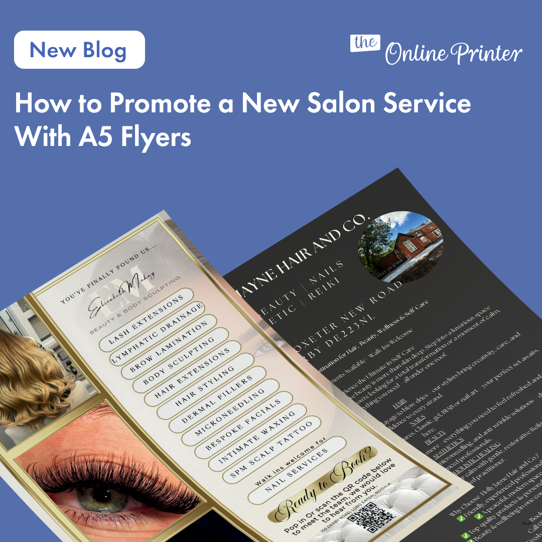
If your business needs to communicate more detailed information, professionally printed A5 Flyers can do that job instead. Use your card for essential contact details and allow flyers to explain services, offers, packages or pricing. Each piece of marketing then has a clear purpose.
Poor-quality logos are another issue. A logo copied from a website, screenshot or social media profile may not have enough resolution for professional printing. Wherever possible, use the original high-resolution or vector artwork supplied by your designer.
Don’t forget about spacing. Empty space isn’t wasted space. Giving your logo and contact information room to breathe can make the design feel considerably more polished. Filling every available millimetre usually makes important information harder to identify.
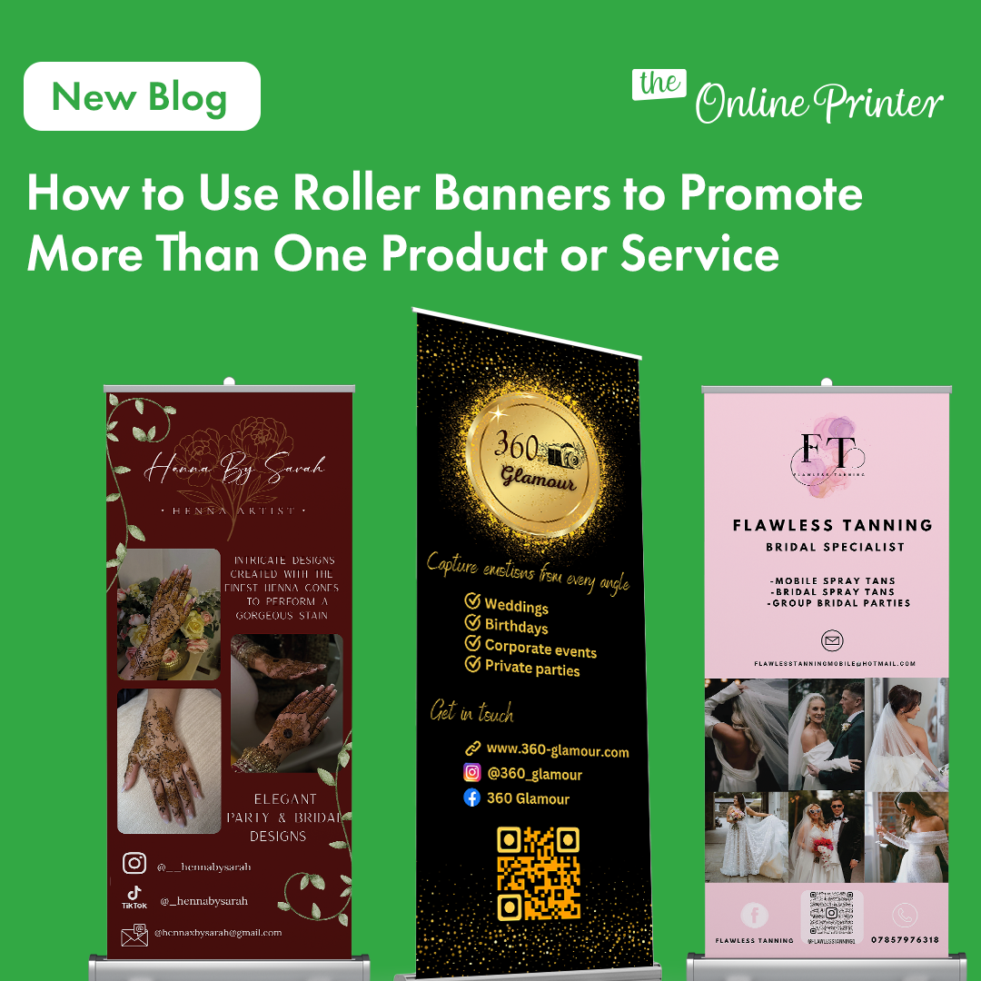
Consistency across your marketing materials matters too. If you’re using a Roller Banner at an exhibition or inside your premises, customers should be able to recognise the same company when you hand them your business card. Matching colours, logos and typography helps strengthen your overall brand identity.
Another mistake is forgetting what happens after someone receives the card. A clear website address or QR code can give people an immediate next step. Depending on your business, the QR code could lead directly to a portfolio, online booking page, menu or enquiry form.
Be cautious about adding QR codes purely because they’re popular. They should provide genuine convenience and must remain large enough to scan reliably. Always test the finished code before sending your artwork to print.
If your company sells experiences or services, professionally printed Gift Vouchers can complement your business cards without competing for space on them. Rather than trying to advertise every product on one tiny card, use separate printed materials for different customer needs.
Spelling mistakes are particularly damaging because business cards are designed to communicate important details. Check telephone numbers, email addresses, names, job titles and website addresses carefully. Ask someone else to proofread the card before approving it.
You should also review your cards whenever something changes within your business. If you’ve moved premises, changed your telephone number or launched a new website, continuing to distribute outdated cards can cause unnecessary confusion.
Finally, remember that the card itself represents your brand. Professional printing, clear artwork and thoughtful design can help create something you’re confident handing to customers.
The strongest business cards are rarely the most complicated. Keep your information focused, use high-quality artwork and make every element easy to understand. By avoiding common design mistakes, your business card can create a professional first impression and give potential customers a simple way to continue the conversation.